This March, is all about those bold enough to choose the most black sheep of beats–be it a conga kid in a bongo burgh or someone who won’t get caught with a snare. Over-beaten metaphors aside, we think bravery is the best kind of beauty.
***

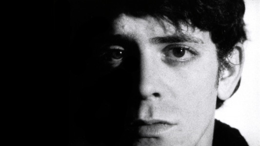
Andy Warhol. Screen Test: Lou Reed (1966). 16mm film (black and white, silent). 4 min. at 16fps @ 2010 The Andy Warhol Museum, Pittsburgh, PA, a museum of Carnegie Institute.
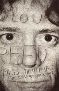
By the time I picked up Lou Reed’s lyric collection, Pass Thru Fire, I was already a fan of the content of the man’s work. Growing up listening to my brother’s Velvet Underground albums and picking up his breakthrough Transformer album, Lou’s lyrical prowess and lack of sentimentality struck an instant chord.
I’d expected a simple collection of song lyrics from his 30+ year career presented in a straightforward fashion. After all, these were just words, right? What I didn’t anticipate was the presentation Stefan Sagmeister brought. I was not versed in design or typography, so Sagmeister’s willful experimentations with typefaces, page color, gradients, etc. were a revelation. Each album and, in turn, every song was adjusted with words that appeared to dribble across the page–some were even forced to turn the volume a full 360 degrees.
At first, I was frustrated because I simply wanted to read the poetry Lou was so adept at putting together in his uniquely New York tone. I realized, though, that the visuals and words matched perfectly, because Lou Reed was not an easy artist to embrace or even like. His songs challenge you to feel empathy for those who normally do not elicit it. His world is often cold, with moments of beauty interspersed ephemerally.
He does not invite you in, but once you are in, it’s hard to leave. Sagmeister’s design perfectly mirrors this personality in the layout; neither man makes this work easy to penetrate, but once you finally give in to them, you’ll never want it any other way. This perfectly imperfect marriage of content and form has stayed with me, whether I’m writing film reviews or website copy. It’s demonstrated to me, in no small fashion, how personality can be captured in the union of idea and form, despite the manner in which its presented.
***
 ~~~Todd Konrad is a content marketer and blogger, with years of experience working in the entertainment industry. Former Online Editor of IFQ Magazine, Todd interviewed a variety of leading filmmakers while covering the independent film world. He has now pivoted into the world of startups, looking to help build nascent brands into future leaders with his creativity and focus. His personal blog archive (and future revamped brand) can be found at Vegas Outsider.

