First: The Theme Description
This month we’re celebrating the people who’ve helped us blossom into the people we are today. Whether they held the watering can once when you were feeling likely to wilt, spent rigorous outdoor hours watering and weeding, or sat by your side and coached you through your growth, we believe all mentors are worth honoring.
Second: Inspirations
Dream A Dream – Be a Mentor (Animation)
Third: Storyboards
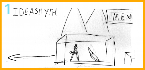
The glass container seemed out of place, and was omitted to make room for more pedestals.
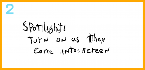
It took a while to figure out what was the best way to ‘light up’ the figures without transparencies. Ultimately we choose to make the solid colors of each figure outlined to illustrate illumination.
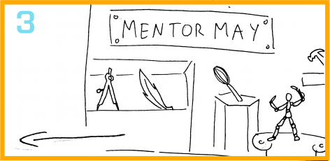
Only some tools on their pedestals were not included in the final graphic, to reduce clutter and simplify the design.
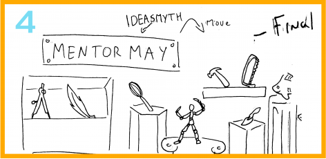
The “Mentoring May” was separated into two plaques so it could be easier to read, and the “Ideasmyth’s Ideablog” was placed on the lower right hand side. That way it was a little more balanced and we can put some emphasis on the Mannequin.
Fourth: Static Graphic
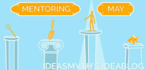
The static graphic was created using Adobe Illustator.
Fifth: Animated Gif

The animation for this gif was created using Adobe Flash.
Credits
Storyboard: Mr. Connor Vallee, Static Graphic: Ms. Fabiana De Lilla, Gif: Ms. Fabiana De Lilla, Description: Ms. Kim Kaletsky
