First: The Theme Description
Old Irish legend says that finding a finding a four-leaf clover is a sure sign of luck. But this month, we’re bringing the luck to you and serving up some tales of good fortune that’ll have even the leprechauns feeling jealous.
Second: Inspirations
Third: Storyboards
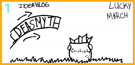
The addition of the clouds helped fill in the negative space as well as make the “lucky march” type pop more.
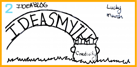
The placement of the “Ideablog” type was added underneath the “ideasmyth’s” type to help illustrate the rainbow.
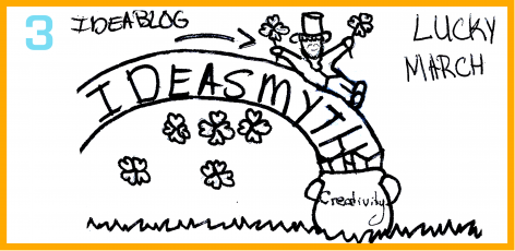
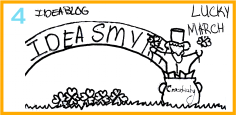
The words “creativity was omitted since it couldn’t read on such a small scale. Less books were placed in the pot to help the viewer understand what they were looking at.
Different Version
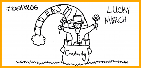
This was another possible layout idea for the Lucky March 2016 ideablog banner. It is a more centered design, however it would not work in an animation since the bend of the rainbow was to high and the leprechaun would move of screen.
Fourth: Static Graphic
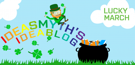
The static graphic was created using Adobe Illustator. We choose to leave out the outline of the rainbow and instead use different colors, in each letter, to illustrate a rainbow.
Fifth: Animated Gif

The animation for this gif was created using Adobe Flash.
Credits
Storyboard: Katarzyna Bibulowicz, Static Graphic: Katarzyna Bibulowicz, Gif: Katarzyna Bibulowicz, Description: Ms. Kim Kaletsky
